Composable components: how changing teams changed NewsKit
A radio station's audio player, three months of work, and why NewsKit moved from reusable to composable components.
Published
This is the third of four write-ups from my Web Expo talk, Building NewsKit. It follows adoption and advocacy.
Composable components let you combine and assemble parts into complex interface elements, while keeping flexibility and consistency. Those two things sound like opposites, and for a long time I treated them that way.
Flexibility versus consistency
Flexibility is the designer or developer saying "give me creative control" and "let me build what I want". Consistency is the system saying "everything should be the same".
There's more to consistency than sameness, though. It comes in three kinds.
- Visual consistency gives the whole interface a harmonious look and feel.
- Interaction consistency means components behave predictably and similarly in different parts of the application.
- Usage consistency means consistent APIs and coding conventions, so using the system is predictable.
My argument is that NewsKit wasn't flexible enough.
The radio stations
A few years back News UK acquired some radio stations, and started a new one too. One of them, Wireless, got in touch. They'd just joined, and they needed a component that could play the radio.
We looked at their stations and saw a lot of radio stations doing the same kind of thing. We said we'd get back to them in a couple of months.
We did. Version one of the audio player took three months to build, and this is how you used it:
import React from 'react';
import { AudioPlayer } from 'newskit';

export default () => (
  <AudioPlayer
    src="https://timesradio.co.uk/stream"
    live="true"
  />
);
Then the feedback arrived. The player lacked flexibility, it was hard to use, and customising it was complex. We'd solved the initial ask, but how do you evolve beyond that?
Why a single solution wasn't enough
As we hone in on one specific solution, we naturally explore other avenues. That mattered because multivariate testing and experimentation are at the heart of the business strategy at News UK. Prescriptive components defined by the system go against that strategy. People needed building blocks so they could discover their own solutions.
Nick Dorman, Head of Design Systems at News UK, said it like this:
"It's crucial that we provide our users with a wide array of tools that they can mix and match to create truly unique experiences."
So we rebuilt the audio player.
The composable audio player
The new player is a parent component, AudioPlayerComposable, which does three things. It adds sound to the page, it provides context to its child elements, and it handles interactions.
Everything you can see on the player is a separate piece. There are nine of them, which we call subcomponents.
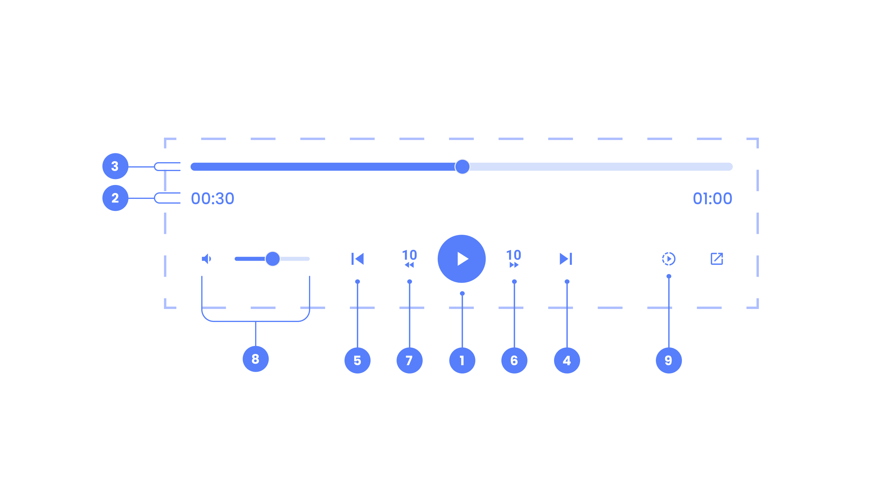
Nathan Curtis defined a subcomponent in April 2023, in How to make and share more flexible UI components, as "an independent UI component with a well-defined API intended for use only within a specific parent".
In code, the parent wraps whichever subcomponents you want. Roughly:
<AudioPlayerComposable>
  <AudioPlayerPlayPauseButton />
  <AudioPlayerForwardButton />
  <AudioPlayerBackButton />
  <AudioPlayerReplayButton />
  <AudioPlayerSeekBar />
  <AudioPlayerTimeDisplay />
  <AudioPlayerSkipNextButton />
  <AudioPlayerSkipPreviousButton />
  <AudioPlayerVolumeControl />
  <AudioPlayerPlaybackSpeedControl />
</AudioPlayerComposable>
Context joins the parts
Context is how a parent and its subcomponents share information. The parent knows things the subcomponents need:
- How long the audio track is.
- What the current progress is.
- Whether it's playing.
- Whether it's live or pre-recorded.
- How fast it's playing.
- Which tracks come before and after in the playlist.
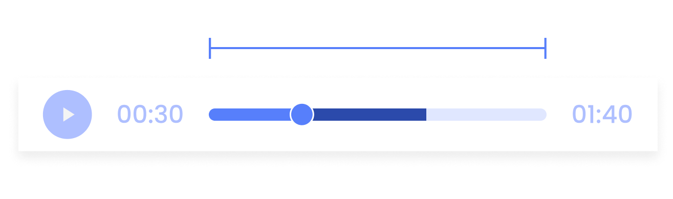
The seek bar needs the length of the current track and the current progress, so it can draw the progress bar as an overall percentage. The play and pause button only needs to know whether the audio is playing, so it can show the right icon. Each subcomponent reads what it needs and ignores the rest.
What makes a good subcomponent
I think a subcomponent should be configurable, optional and maintainable.
Configurable
Most subcomponents come with their own properties, which gives designers and developers flexibility. That runs from simple styling overrides to changes in behaviour:
<AudioPlayerPlayPauseButton onClick={() => doSomethingFun()} /><AudioPlayerPlaybackSpeedControl showInModal />You also get freedom over layout, because the order and arrangement of the parts is up to you. You can try this yourself in our Storybook at storybook.newskit.co.uk, and the Figma components are on the community at figma.com/@NewsKit.
Optional
With composability it's easy to leave subcomponents out. A live stream has nothing to seek through and no speed to change, so you drop the seek bar and the playback speed control. On mobile screens you can hide the volume control.
Maintainable
Subcomponents are easier for us to maintain too. Each one lives in its own folder in the code and its own component in Figma, so we can focus on one subcomponent at a time. Simpler maintenance leads to more contributions.
It's working well, and I think it's the way forward for us. Nick said:
"With the new design system, we've been able to create a much more composable and flexible system that allows our users to build up their experiences from smaller, reusable components."
Shifting our focus
Our focus moved in two ways.
The first is from reusability to composability, and then to reusable composability. With reusable components, designers and developers import and use assets as components. With composable ones, consumers build custom configurations out of smaller parts. Reusable composability is when those custom configurations get distributed through teams.
The second is from consistency to flexibility, and then to consistent flexibility. Consistency means everything behaves as we expect, and consumers understand that. Flexibility means consumers can build what they want. Put them together and consumers can build what they want, and it still behaves as they expect.
The result is that consumers own and maintain their own local design systems. These contain decisions only relevant to them, including style overrides and saved configurations of components. People get to make what they want and reuse their decisions for consistency.
It also means the system's proposal for a default component doesn't have to be the default for a consumer.
Stepping stones for new ideas
Rethinking the approach let us give the initial customer more control, and provide more lower-level foundational components.
Composable components also become stepping stones for new ideas. Satellite teams are using them to make new things. The Times have been investigating text-to-speech and spoken-word articles. With composable components they could design and build a player that works within the context of an article, and they've started experimenting with audio articles.
That unlocked one of NewsKit's key missions, empowering product teams to build things quickly. Henry Daggett said in 2023 that we should "give contributors the enjoyable stuff".
Some things aren't so enjoyable, such as waiting for other teams, code reviews, compromise and writing technical docs. What people enjoy is building cool stuff, learning quickly and responding to real user feedback.
Nick wrote about this journey in How an audio player component tells the story of NewsKit Design System's changing strategy. Along the way we learned that full-scale solutions weren't always going to be the way forward for NewsKit.
The last article collects the lessons I'm keeping.